As people become more aware of various learning difficulties and disabilities, and making our content accessible to everyone is super important. We believe there's no reason not to cater to all, and that means thinking about things like choice of font and branding, which can really impact how easy it is to read for folks with dyslexia. That's why we'd like to share with you why we've decided to use the dyslexia-friendly font Lexend for our content, striking a balance between professionalism and inclusivity.
Accessibility – why it matters
Accessibility is all about making sure products, devices, services, or spaces work for people with disabilities or learning difficulties. It's not just the right thing to do, it's also the law in loads of places, like here in the UK. The Equality Act 2010 says businesses and organisations have to make a reasonable effort to meet the needs of disabled individuals.
When we design with accessibility in mind, it's a win for everyone, because it helps build an inclusive society where info is easy to get hold of and understand. By thinking about accessibility, designers can make content that looks good and works well for people with all sorts of cognitive or physical challenges.
How fonts make a difference in accessibility
Picking the right font is super important for making content accessible to people with dyslexia. Dyslexia is a learning difficulty that affects how someone reads, writes, and spells. Around 10% of the UK population has some level of dyslexia, which makes it one of the most common learning challenges.
Fonts can really affect how easy it is for those with dyslexia to read and understand text. Some fonts can make letters look squashed, mixed together, or hard to tell apart, which makes it tough to figure out similar-looking characters. Plus, fonts with wonky spacing or tight letter gaps can make it tricky to spot individual words or letters.
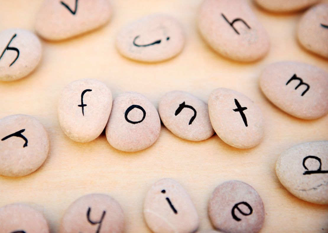
Introducing Lexend
Lexend is a collection of fonts specially made to boost readability for people with dyslexia. It was created by Bonnie Shaver-Troup, an educational therapist, and Thomas Jockin, a typeface designer. Lexend is based on research about how typography affects reading speed and understanding.
The Lexend font family has seven typefaces, each with different widths and spacing so people can choose what works best for them.
Lexend's unique features include:
- Consistent character shapes: Lexend uses regular shapes for similar-looking characters, like 'b' and 'd', to help cut down confusion and make reading easier.
- Bigger x-height: The x-height, or the size of lowercase letters, is a bit larger in Lexend than in traditional fonts, making the letters clearer and simpler to read.
- Wider letter spacing: Lexend has more space between letters and words, which cuts down on visual clutter and makes it easier to spot individual characters.
- Open counters: The open counters, or the closed-off spaces within letters, in Lexend are bigger than in standard fonts, which helps tell characters apart.
- Unique ascenders and descenders: Lexend has distinctive ascenders (the upward stroke of a letter) and descenders (the downward stroke of a letter), which make it easier to tell similar-looking characters apart.
Thanks to these design features, Lexend has been shown to improve reading speed and understanding for people with dyslexia, making it a top choice for accessible content.
Why we chose to use Lexend
We decided to use Lexend for our content because we want to make a space that's welcoming and works for everyone's needs. By using a font that's easier for people with dyslexia, we're trying to make sure our content is as simple to read as possible and available to as many people as we can, no matter their learning abilities.
Lexend doesn't just help people with dyslexia – it makes reading better for everyone. The clear and easy-to-tell-apart letter shapes, nice spacing, and consistent design make Lexend a brilliant font choice for all users. It leads to a more enjoyable and comfortable reading experience for everyone.
Spreading the word on accessibility
Choosing to use Lexend is all about showing our dedication to raising awareness about the importance of accessibility in design. By going with this dyslexia-friendly font, we're hoping to inspire other content creators, businesses, and organisations to think about how their design choices might impact users with learning difficulties and disabilities.
It's important to remember that accessibility isn't a one-size-fits-all solution; it's an ongoing journey that needs constant evaluation and tweaking. By talking about our experiences and championing accessible design elements, like Lexend, we're aiming to help create a more inclusive and accessible digital world.
Remember, picking the right font can make a world of difference for people with dyslexia and other learning challenges. Lexend is a great choice because it's easy to read and understand, making it spot-on for designs that work for everyone. By using Lexend in our content, we're working to include everyone, spread the word about accessibility, and encourage others to think about the impact of their designs on people with learning difficulties and disabilities.
Whether you need a chewable toy, a tactile toy, or something to fidget with, Tink’n’Stink has a range of branded fidget toys that can help. We offer a range of brands that have been designed with individuals with Autism and other special needs in mind, ensuring that our toys are effective and safe to use. Visit our website today to explore our range of branded fidget toys and find the perfect toy for your needs.


